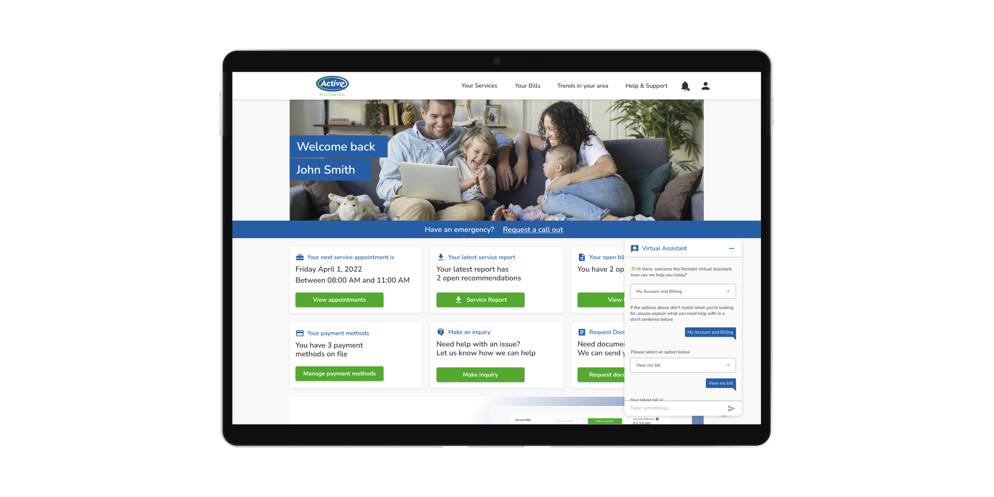
UI/UX - Omnichannel Self Service
Empower our customers to use our services their way.
Arguably my favourite project I’ve been part of (so far). The mission statement was clear, how do we produce a world class omnichannel solution that allows our customers to do the tasks that they would usually contact our call centres to do. Thus creating a saving in our call centre costs, but also to bring pest control services into the 21st century.
Working closely with stakeholders, we determined a list of 26 requirements that solved for a majority of the calls coming into our call centre. These included; “Tell me when my next visit is”, “I want to view and pay my bill”, “I want to reschedule my appointment”, “I want to view the details of my last visit” and few more that you’ll see below. The solution also had to work for the potential of multiple pest control brands and themes, meaning every design decision had to incorporate a global thinking rather than be brand specific.
As the sole designer on this project, I began by looking at our competitors and best in class service provider offerings to gain inspiration. This also allowed me to find the baseline for the features that we were looking to deliver and which of these were most common. As it turns out, most of them were very common, and we (at the time) were behind the curve. Then after one iteration, two weeks and a bunch of coffee. I managed to put the pieces of the puzzle together that encapsulated all of the 26 original requirements in one end to end high fidelity prototype for our new self service portal solution. As well as our omnichannel pieces, which translated the journeys mapped out in those requirements into whatsapp/sms, email, live chatbot and IVR solutions.
We then organised our list to find the MVP features that would allow us to provide the most value for our business and our customers by looking at the highest volume of calls into our call centre. So although we had an end state in mind, we now had to strip the entire design back into the most valuable items and the minimum viable product. Something I’m really proud of here, is that the original design system that worked for the “end-state” was easily translated into the MVP version of the portal, and still is the case almost two and a half years later as we improved and iterated on our features.
As I mentioned, over time we’ve been able to improve and iterate on the portal as business needs shifted and customer feedback came in. It was an incredible project see evolve from the ground up, and one of those projects that will forever be a defining moment in my career.
Over the first two years of being live, we were able to deploy the portal to 18 different brands with varying themes, make a saving of 63,000 hours in our call centres which is the equivalent of $1.7m, and we also were able to covert over 50% of the previously manual payments into our digital solution, amongst other accomplishments.
Not only did this project test my UI/UX skills, but it really allowed me to sharpen and ultimately improve my softer skills. By having weekly reviews with our stakeholders, I had to ensure my communication and presentation skills were clear and concise, so that we could review prototypes to produce the balance between delivering an incredible experience for our customers, as well as meet our business needs. This project also became the model for how we implemented design into our other teams and product processes. By producing high-fidelity prototypes at pace and effectively communicating this to the development team early in the process, we were able to get buy-in from the internal team to empower the conversation with our stakeholders to ensure we could actually deliver what was required. By championing prototyping before coding, we were able to prove the power of the design-first philosophy, to streamline the development process which fostered creativity and more importantly minimised potential setbacks.

