UI - Data Visualisation
Show old data in a new way.
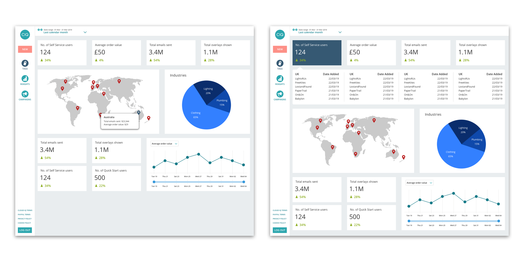
The projects on this page show my skills in data visualisation. The task at hand was to redesign the company platform, and the insights page was a key part in the new platform. I had to show data fields that were familiar to our existing clients and add in new fields that would allow our clients to get a broader insight into their campaigns. The image above was for the high level dashboard, this would be the screen that would appear when a user clicked on the insights tab on the navigation. This would be fully customisable to suit the needs of each individual, and what they deemed important to them.
The screens below were some of the first drafts for the new insights page but the challenge was to see if we could adapt it for iPad users. The components already existed, I just had to ensure it worked on this new grid.
iPad adaptation.
Finally, below is an iteration of our original insights design. The aim here was to clean up the data fields to be more legible and to group data together, for example the user would be able to see the previous period directly under the current period which would allow them to see the comparison quicker. The first iteration was built and on the platform, however the company decided to use a plugin for the second iteration. All of these screens were created on Sketch.
Updated data screens with a component per data piece.
