UI/UX - Search Upgrade
A rework of an existing experience
The challenge ahead of us was to upgrade the search experience on our data amalgamation platform. The first version of our search module had gone out to our client and we were tasked with improving the usability. One of the restrictions given to the design team (consisting of one other designer and myself) was that because the client didn’t want to pay for a complete overhaul, we had to re-use what we had.
This was one of the first projects I got to sink my teeth in to when I joined the company, so I was chomping at the bit. With this being part of my introduction to the company, my role was simple, use your fresh eyes and figure out how to update the user experience with what currently exists. Challenge accepted
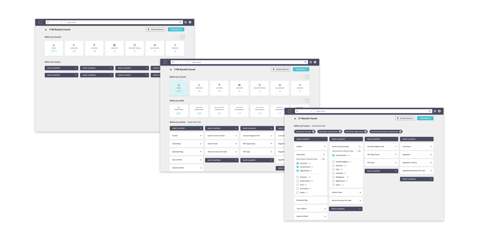
Existing search experience - Too many steps for a user to see the results.
My research for this task was simple, what do we currently have and how can we make the search feature more useful for the user. This is the entry point to our platform, it is how you access all of the records we bring together, it has to be as simple as it can be. Looking at other search engines, a couple of key experiences could be taken to improve our platform almost instantly. From Google, we could show the most relevant results instantly after a search, and from Amazon, we could give a more detailed facets and filter function to the user. The research aligned with our client’s main pain point, they wanted to be able to see the results in the least amount of clicks. In the example above, the flow was as follows:
User enters a search term.
The count cards for each entity type update.
User selects entity type to search against.
User is then able to filter and facet by our data model clusters.
Once the number of results was below 50, the results grid is returned.
This wasn’t intelligent enough for the user, it implied that the user always knew what they were looking for. As we know from our own search experiences this might not always be the case.
Intial wireframes to improve the two outlined improvements - L to R - Initial thoughts, Facets and filters, Results grid relevancy.
The challenge was interesting from then on, with the restriction of using what we had, but with improvements, we in the design team worked on how we could make a number of small improvements that would have a much larger effect on the user. The two main improvements I wanted to focus on was the filters and facets piece, and giving the user more clarity on why the results they were seeing were the most relevant to their search. As seen in the sketches above, I attempted to put ideas together, which then turned into a number of tweaked high-fidelity wireframes. With this project being part of my introduction to the company, I made sure to get feedback from my team member to understand the context of the content I was adding to the design so that it would make sense to the client and to our internal audience. I was given the opportunity to present to this wider audience, including business analysts and our main stakeholder, and that was a fun experience as I was able to gain a deeper understanding of what we were trying to achieve and whether these designs worked. Luckily for me, only a couple of minor tweaks had to be made, with the below being the final result.
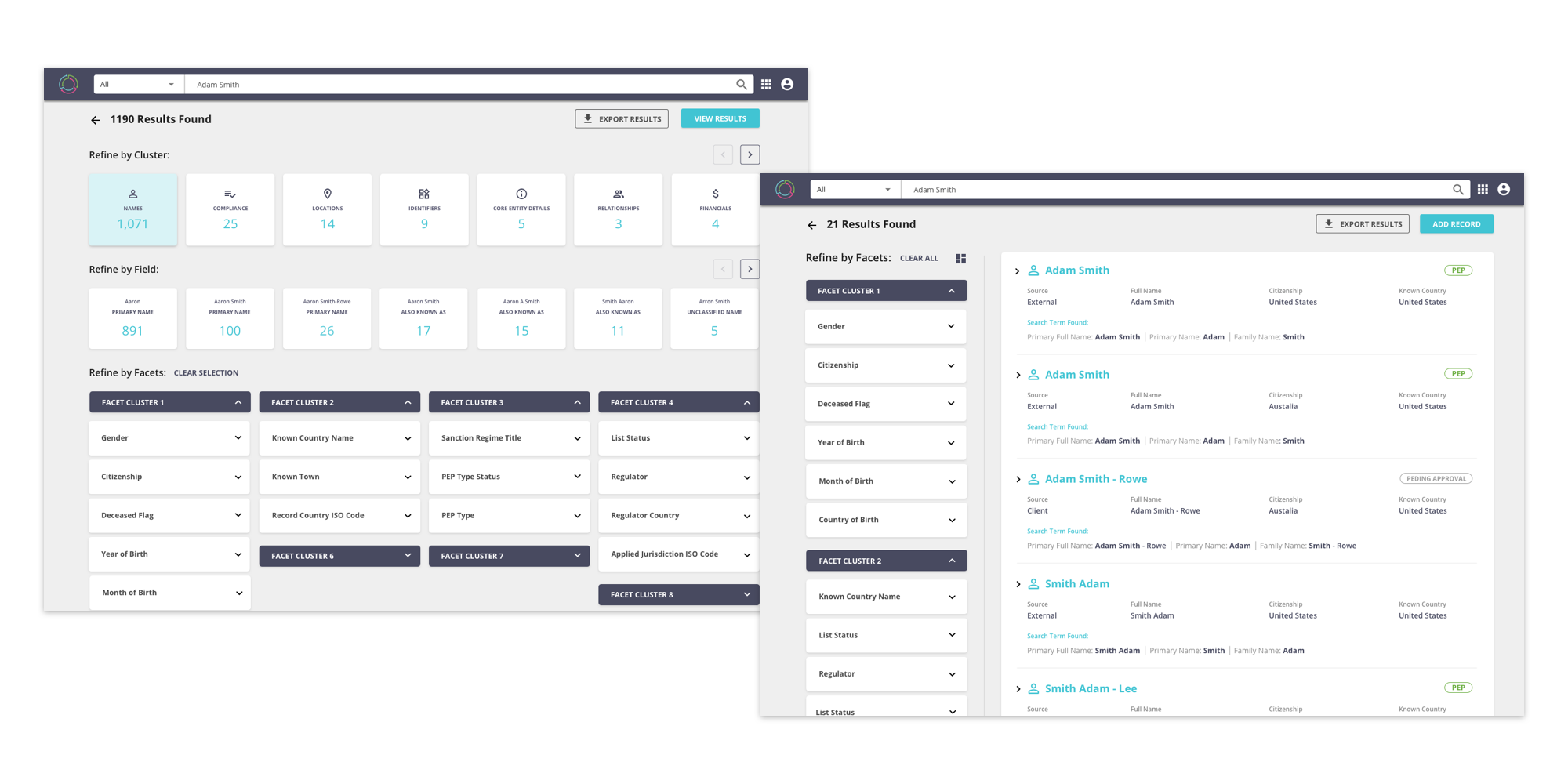
FInal experience - Displaying the results grid directl
Filters and Facets - Giving the user the ability to drill down through our data model fields and through the available filters.
The rationale behind the final design was that we needed to get the user to the results grid in the least amount of clicks, and we need to give the user the ability to narrow down their results in a more organised manner. The flow for this new search experience was as follows:
User enters a search term.
Search results appear.
User can scroll through the results or narrow down using the filters and facets on the left hand side of the results grid.
By instantly cutting out two steps from the previous experience we were able to give the user a quicker experience, but we were also able to make use of the entity cards on the front, by keeping them as a discovery piece. A user could simply select the entity type count and go through the filters and facets screen before they get to the results, in case they weren’t quite sure what they were looking for.
To organise the filters, we implemented a grouping structure based on our data model, so that the filters would make more sense to the user, as well as allowing the user to select multiple options within one filter, with an “AND/OR” option toggle. This would give the user a chance to get closer to an exact search.
Takeaways from this process was that I believe having fresh eyes on the existing product was incredibly useful, and the restriction of using what we had, actually made my life simpler, as we were able to give the user something they were familiar with, but a completely more intelligent experience. Thankfully the client was appreciative of this upgrade, as it ultimately saved them time, which allowed them to get more done in their day using our platform. If I were to give this a new upgrade, i think I would make the filters on the results grid screen more subtle, and make the grid tighter to be able to display more results in a smaller space.


